What is a Landing Page?
A landing page is usually a standalone web page where a visitor lands after they click on an ad, a social media post, a search result or a link in an email.
Wikipedia defines it as: "In online marketing, a landing page, sometimes known as a "lead capture page", "single property page", "static page", "squeeze page" or a "destination page", is a single web page that appears in response to clicking on a search engine optimized search result, marketing promotion, marketing email or an online advertisement."
The primary ‘Job’ of a landing page is to capture information of potential buyers as part of a sales funnel.
How to Create High Converting Landing Pages
There are different success keys for different pages of a successful website and/or a blog. Writing Home page content is different than writing an About page, as the ‘Job’ of each page is different, they may represent different parts of the sales funnel and the desired outcome or Call To Action may be different.
Landing pages are critical pieces of online marketing. In this article, we will reveal the best practices in a checklist.
Most people won’t get it right the first time, and you’ll want to evaluate your progress and revise your landing pages as needed.
Using Analytics, follow the paths your site’s visitors take thru your website to find what’s working and what’s not for each sales funnel you create.
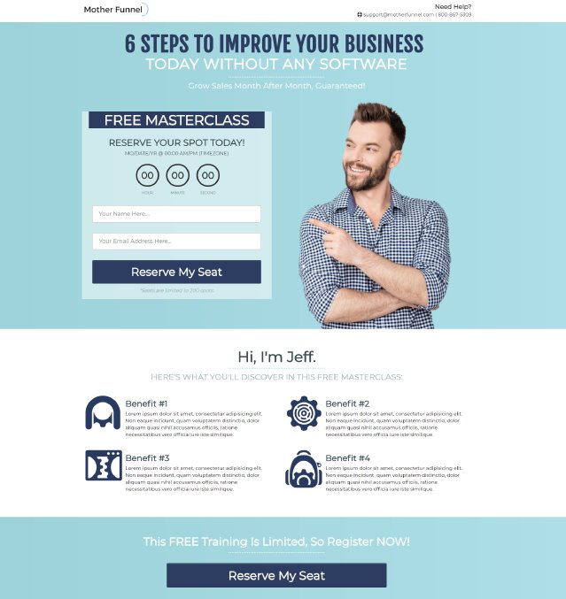
The headline offers something of value, nice hero image pointing to a countdown timer. 4 benefits of participating and 'Reserve My Seat' Call To Action.
Creating Landing Pages for Search and Display
What you’ll learn in this article may also be useful in creating content for pages other than landing pages.
Having a comprehensive understanding of who your ideal prospect is will be critical to your success, whether you’re writing a landing page, blog post or Home page,
I have written previously about the core desires of your target audience https://websitesuccessguy.com/core-desires-of-your-target-audience/ and it’s the focus of my eBook “Discovering Your Dream Clients.” https://websitesuccessguy.com/discover-your-dream-clients/
There are dozens, if not hundreds, of things you can document about your ideal customer (AKA Target Persona or Client Avatar), including location, gender, education, industry/niche, age, interests, where they hang out so you can study or engage them,etc.
Start by making a list of all the best attributes of your best customers. You should also consider the bad traits of your customers from hell. And avoid them!
Once you have one or two Target Personas defined, it’s time to develop your strategy.
Define the purpose of your page in 150 characters or less.
PURPOSE
What exactly do you want to do? Better, what do you want THEM to do? What is the ‘Job’ of this landing page.
CONTENT
Once you decide what you want them to do, what content can you create to convince them to do it?
Most say the headline is the most important element on any web page but even more important on landing pages.
According to Unbounce, effective landing page headlines have three essential ingredients:
Focus: Your headline should focus on one topic, one goal.
Relevance: Your headline should directly relate to your offer and CTA.
Benefits: Describe a clear benefit; communicate your unique selling proposition ASAP.
The Call To Action is not always to buy something, but it could be part of the customer journey that gets them to buy, maybe more than once. The CTA might lead to more content that pre-frames your offer.
Usually, it’s a link to a lead magnet that adds them to your list; coupon, white paper, ebook, video, etc, or ask them to complete a survey.
Read more about developing lead magnets here. https://websitesuccessguy.com/how-to-grow-your-email-list-creating-lead-magnets/
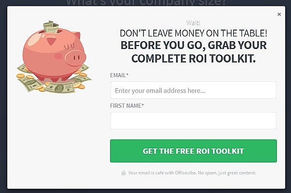
Landing pages are usually presented as single pages, with no navigation to tempt the visitor, but they can also be presented as pop-ups over a page as seen above.
Decide which content would be the most compelling and lead to an Action. Different people consume content in different ways. There are at least 15 different types of content to choose from; blog post, downloadable lead magnet or white paper or ebook, video, Infographic, audio, spreadsheet, brochure
Prioritize key information at the top of the page, including headlines, email opt-ins, a buy button or video.
Test content with users. Do they understand your offer? Do they know how to take the next step?
Take it a step further with usage tracking; including heat maps and scroll tracking to gain clarity on how people engage with your content.
What is a good conversion rate for a landing page?
The average landing page converts at just under 10%, but different industries convert at different levels. And any landing page will perform based on how it was built, so it’s important to split-test each element.
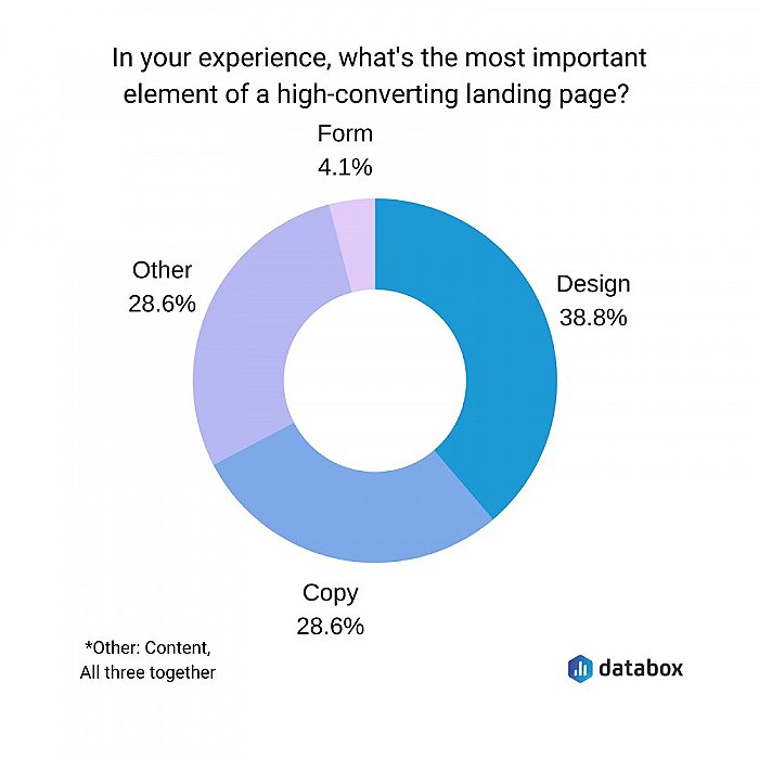
According to a study by Databox, the most important element of a high converting landing page is the design. Second is the copy.
What is a good Bounce Rate for a landing page?
Bounce Rate is roughly the percentage of visitors to a website or web page who do not visit another page on the site. It is a loyalty KPI.
It’s not uncommon to see Bounce Rates of 80%, which means 8 out of 10 visitors to your site don’t click anywhere else.
Landing pages tend to have higher Bounce Rates than normal because they often don’t have site navigation on the page because the primary focus is to get the opt-in.
However, most opt-in pages will send the subscriber to a success page, which would lower the Bounce Rate.
Quick Sprout says a realistic bounce rate for landing pages hovers between 70% and 90%, which is an achievable goal.
A high Bounce Rate is not necessarily a bad thing. If someone searches for information and the page they land on provides it, it is not unreasonable that they would move on to another site.
You might also compare the Bounce Rate of your landing page to the BR of the entire site for further insight.
Landing Page Framework
When building your landing page, consider the following:
Headline
Subheadline
Images (Including the primary image or ‘Hero shot’)
Messaging: A brief description of what you’re offering - your Unique Selling Proposition (USP).
Readability (5th grade reading level, short sentences)
Social Proof: Gain visitor’s trust with testimonials or security badges.
Sense of Urgency
A prominent Call To Action button.
The Perfect Squeeze Page
Legendary online marketer Justin Brooke has created campaigns that have resulted in millions of dollars in sales for an impressive list of clients. He was very interested in online success, especially driving paid traffic to landing pages that begin a prospect’s sales journey.
Over the years, he split-tested key components of successful landing and squeeze pages. He won $3,000 from LeadPages for his design of “The Perfect Squeeze Page,” which beat their current best performer, designed by James Schramko, also a legendary Internet marketer.
The design continues to be used to this day.
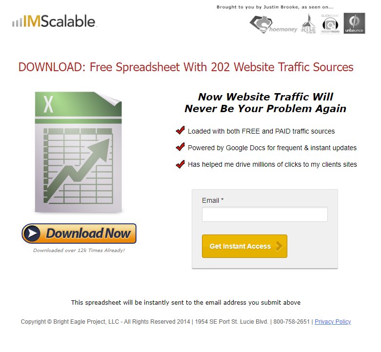
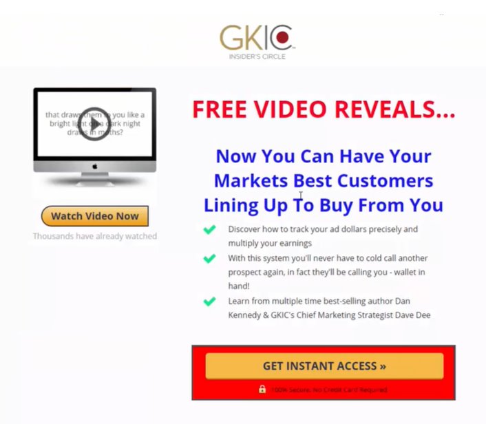
The Perfect Squeeze Page begins with the company logo prominently displayed at the top of the page as seen for IMScalable and GKIC. Logos establish identity.
IMScalable includes trust icons in the form of …as seen on… which build trust.
An image of what’s being given away; eBook, video, spreadsheet, etc is critical to the Perfect Squeeze Page with a button labeled “Download Now” or “Watch Video Now.”
Next is a strong Call To Action. The Buy button design has significant impact, similar to what Amazon uses. Sometimes a subtle arrow pointing to the button is used on squeeze pages.
DOWNLOAD: Free Spreadsheet With 202 Website Traffic Sources
FREE VIDEO REVEALS…
Now you get this…Website Traffic or Best Customers
3 bullet points.
Opt-in right on the page or a button offering INSTANT ACCESS that links into a simple opt-in page.
I would also include a promise like the one at bottom of IMScalable: “This spreadsheet will be instantly sent to the email address you submit above.”
Landing Page Checklist
1. Site Accessibility. Since one in four Americans lives with some kind of disability, including auditory, cognitive, physical and visual, they may be unable to hear the videos or read the copy you’ve written. Don't shut out 25% of your visitors by not being accessible. Use a free website accessibility checker to learn more about Web Content Accessibility Guidelines. (WCAG)
https://www.accessibilitychecker.org/
https://accessibe.com/accessscan
2. Split Test. Test your copy and Call To Action. Your landing page copy must be concise. "Chunk" your content for easy skimming. Make the steps you want your visitor to take clear and apparent.
3. Call To Action. You must include a clear call to action (CTA) that tells your audience what to do next. If possible, show it at the top of the page.
4. Product Demo. Your landing page should make a convincing argument for why customers should buy your product. Highlight Features & Benefits.
5. Social Proof. Integrating reviews or customer testimonial videos into your landing page gives you the opportunity to promote all the compliments and 5-star ratings people have given you. Today's consumers check more places for information than ever before. Include trustmarks, if you can.
6. Mobile-Friendly. More than half of website visitors use mobile devices, so it must render well on mobile devices. If you’re using a website builder like Wix, Squarespace, Weebly, Shopify, Big Commerce and WordPress, your landing pages are optimized for mobile.
7. Quick Loading Pages. 3 seconds or less. It's a strong signal to Google and important to impatient visitors. Test your page speed with Google’s Pagespeed Insights https://pagespeed.web.dev/ , Pingdom https://tools.pingdom.com/ offer free insights into how to improve your website and landing page experience. A half second decrease in load time can cut your conversion rate in half.
8. 'Above The Fold.' Confirm to your audience that you have something of interest to them without the need for scrolling. Your Call To Action should be at the top of the page. According to the analysis of eye tracking data from the Nielsen Norman Group, the closer a piece of information is to the top of the page, the higher the chance that it will be read.
9. Good Design is Good Business. The best landing pages have a cohesive color scheme and matches your brand colors and the look and fonts. Good design includes layout and User Experience (UX).
10. A Picture is Worth 1,000 Words. Professional photography can be one of the biggest keys to website success. Use images that delight and draw the visitor in. Clear photos can be taken with a cellphone or tablet too. The most important part of taking good pictures is light.
11. Comparison Tables. Help your prospect understand the advantage of doing business with you by listing all the attributes of your product vs. competitors. Build credibility.
12. Frequently Asked Questions. FAQs not only help increase conversions, but they save time too. What questions are often asked? How can you answer them that also positions your favorably in the market? Your prospects may ask your competitors questions based on your FAQs. Sometimes that helps eliminate them from consideration.
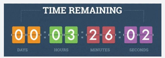
13. Countdown Timers Trigger FOMO. Pages with countdown timers outperform pages without countdown timers by as much as 40%
14. Stay in Touch. Even with an FAQ section, potential customers will still have questions. Will you offer a phone number, email or chat options? They may not buy if they can't get in touch.
Landing Page Mistakes
It’s easy to screw up all the good work you’ve done with your landing page. Make sure your pages are optimized for mobile and load within 3 seconds for a decent user experience.
Make sure the promise of your landing page aligns with the message on the success page. They’re eager to see what you’re offering. Don’t disappoint!
Keep it Simple! Use a single conversion path. Don’t be cute, don’t make people think too hard.
Focus on benefits to them, not the features you’re enamored with. What’s in it for them?
Keep them on the page. Avoid using any navigation, including in the footer.

Kurt Scholle has been building and marketing successful websites for over 25 years in a wide range of markets, including manufacturing, hospitality, optometry, non-profits, authors and public speakers.
Follow him on Twitter or LinkedIn.
Join the Website Success Club on Facebook.
Can he help your organization? Schedule a Call to find out!

